User Experience Basics
Examples of User Experience
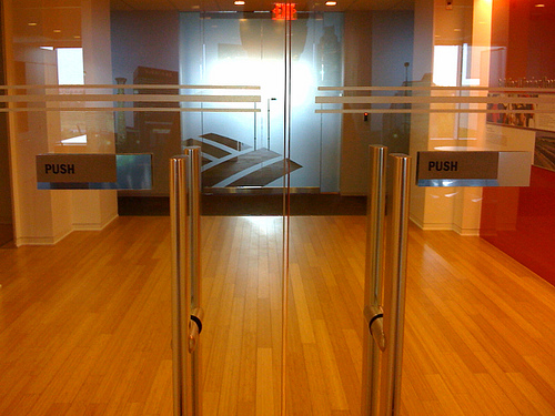
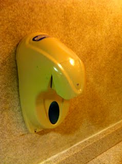
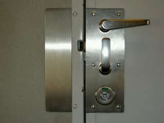
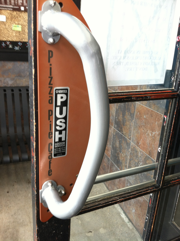
- Discussion: In each case, can you tell how to operate this device? And while you are trying to answer the question, be introspective, and tell me your thought process. How are you trying to find the problem, if any?
[Pito’s] Rules of thumb for good User Experience
- Pay attention to AFFORDANCES
- I want to make you become aware of affordances all around you
- Visual (or other clues) that something can be pushed, pulled, dragged, clicked, etc.
- Without them user is lost
- Know the answer to the question: WHO IS MY USER?
- “Personas”. Note, often there is more than one.
- Build on what users likely have seen before
- Platform consistency (iPhone, Android … but then compare with Flash. Is that a platform? How about web?)
- Conventions: back, home, undo, cut, paste, file menu, etc.
- Guide the USERS’ CONCEPTUAL MODEL (sometimes called the user metaphor)
- Some links:
- What this application or feature is about - that sets expectations?
- What the USER (see above) is ‘expecting’ right now? What is she ‘reaching for’ right now?
- Remember the importance of WORDS that match this metaphor and user expectations
- Metaphors can become dated and inappropriate (file save icon in MS Word is what?) Any examples?
- PROXIMITY Implies RELATIONSHIP
- Put things that relate to each other near each other and vice versa
- Pay attention to the Visual Hierarchy
- Denote hierarchy/nesting of elements: posts->comments, projects->tasks, playlists->tracks, etc.
- Use size (and type choice) consistently to communicate importance/role
- Alignment and balance are important for aesthetics
- Don’t user spend ANY mental energy on questions like this (see book by Steve Krug)
- Where am I?
- Where should I begin?
- Where did they put it?
- What are the most important things on this screen?
- Think about DISCOVERABILITY
- MOBILE is NOT DIFFERENT, but…
- Assume mobile user is distracted, brief attention span
- Does NOT think of device as a computer
- Context: What is users mindset? Where are they, in a car, in line at store, at the theatre?
- Screen is far smaller
- “Mobile First”
- Dealing with COMPLEXITY
- “Simple things should be simple to do, complex things should be possible”
- Principle of progressive disclosure.
- What controls are only available at the back panel of the device, under a little door?
- We all know that users don’t read manuals, right?